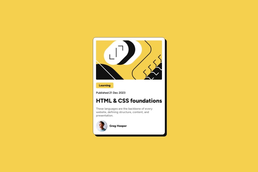
Design comparison
Community feedback
- @Mazz100Posted 11 months ago
@Islandstone89 Hello, your solution looks neat. Great work!
Something that I really want to figure out about animation, when we hover over the header the color gradually ease-in but once we hover away it just disappears, I got the same result when I tried to have a button scaled up. I'm not sure if you want it that way but if you can figure it out I would love to discuss it.
- How to ease-in and out any kind of animation, opacity, scaling, moving. Anything?
Marked as helpful1@Islandstone89Posted 11 months ago@Mazz100 thanks. I'm not an expert in animations. Using
ease-in-outdoesn't always give the desired result.1@Mazz100Posted 11 months ago@Islandstone89 I see. I wish FEM could add some CSS animation challenges and guidance; it could be very beneficial. That said, I think a nice animation exercise can make a big difference for the user experience and is worth investing time in. Good luck, mate. ;)
1
Please log in to post a comment
Log in with GitHubJoin our Discord community
Join thousands of Frontend Mentor community members taking the challenges, sharing resources, helping each other, and chatting about all things front-end!
Join our Discord
