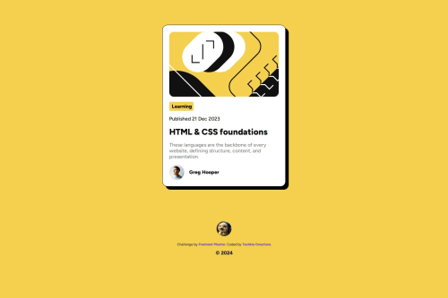
Submitted over 1 year agoA solution to the Blog preview card challenge
Blog Preview Card
@Techkie-Creations

Solution retrospective
What are you most proud of, and what would you do differently next time?
I am most proud of the fact that I created this without external aid What I would do differently next time is a different project since I completed this one already
What challenges did you encounter, and how did you overcome them?I had an issue with the responsiveness of the width of the card and I noticed that it was the padding I had placed on the body that was affecting its responsiveness
What specific areas of your project would you like help with?Just suggestions on how to better it or take into considerations when it comes to design responsiveness
Code
Loading...
Please log in to post a comment
Log in with GitHubCommunity feedback
No feedback yet. Be the first to give feedback on Techkie Creations's solution.
Join our Discord community
Join thousands of Frontend Mentor community members taking the challenges, sharing resources, helping each other, and chatting about all things front-end!
Join our Discord