Not Found
Not Found
Not Found
Not Found
Not Found
Not Found
Not Found
Not Found
Not Found
Not Found
Not Found
Not Found
Not Found
Not Found
Not Found
Not Found
Not Found
Not Found
Not Found
Not Found

Submitted

Blog Preview Card

P

@midnightwebstudios

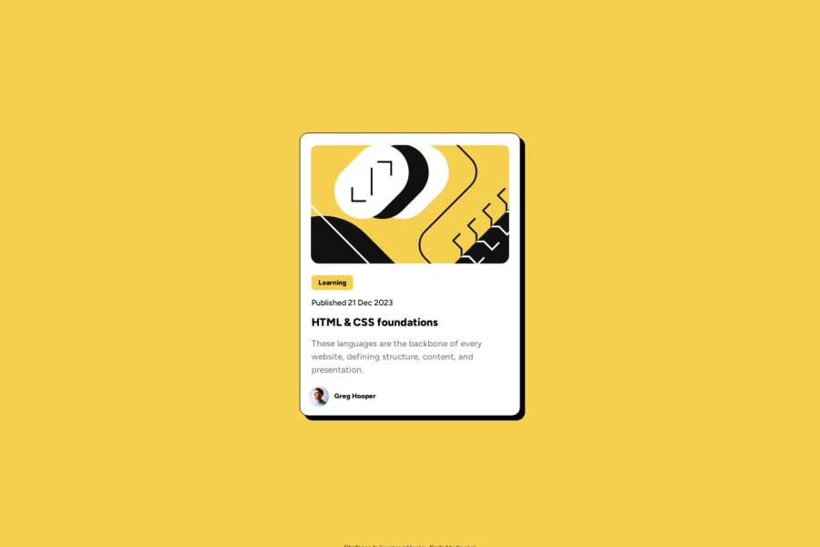
Desktop design screenshot for the Blog preview card coding challenge

This is a solution for...

  • HTML
  • CSS
1newbie
View challenge

Design comparison


SolutionDesign

Solution retrospective


What are you most proud of, and what would you do differently next time?

I'm pretty happy that I built it myself without having to look at solution code. Next time I plan to focus on using flexbox.

What challenges did you encounter, and how did you overcome them?

The one challenge I had was positioning the front end mentor footer text but was able to google some positioning and get it positioned.

What specific areas of your project would you like help with?

I really didn't have too much trouble with this project but any feedback would be appreciated.

Community feedback

@AkoToSiJeromeEh

Posted

Hi there! Great work out there! I noticed that the Card component is not vertically aligned, and I recommend adding CSS properties to the body, such as d-flex and its related properties. Additionally, it's important to include min-height or height for proper alignment. By adding this to the body properties, you can achieve centering of the Card component. . I hope this suggestion helps and works for you. Happy coding!

main {
  background-color: white;
  margin: auto;
  width: 25%;
  position: relative; remove this
  top: 150px;  remove this
  padding: 15px;
  border-radius: 15px;
  border: 1px solid black;
  box-shadow: 8px 8px black;
  font-size: 16px;
  font-family: "Figtree", sans-serif;
  display: flex;
  align-items: center;
}

add this on the body to align the card component to center

body {
  background-color: hsl(47, 88%, 63%);
  display: flex;
  align-items: center;
  min-height: 100dvh;
}

-- also i notice that the blog author is not vertically aligned you can add the code i write down in order to aligned it properly

.avatar {
  width: 10%;
  margin-top: ; remove the margin -top to vertically aligned 
  vertical-align: middle;
}
.author {
  display: inline-block;
  font-size: 12px;
  font-weight: 800;
  padding-left: 5px;
  vertical-align: middle; instead of bottom use middle
}
0

P

@midnightwebstudios

Posted

@AkoToSiJeromeEh

thank you jeje. i sincerely appreciate your feedback. i haven't started using flexbox yet and if i add to this challenge, i have to reposition everything. but i plan to do the next challenge with flexbox and am excited about using your notes. thank you so much!

1
P

@midnightwebstudios

Posted

@AkoToSiJeromeEh

Hi Jeje. I took your advice and re-did the code using flexbox. I was wondering if you wouldn't mind taking a look and giving me your opinion? Just when or if you have the time. I'm not real clear on vh or vw measurements as they haven't really been covered in my course. But I did try to make the code more responsive. Thanks so much for the initial feedback you left me. No one else has commented. I appreciate it and it was super helpful. Take care.

0

Please log in to post a comment

Log in with GitHub
Discord logo

Join our Discord community

Join thousands of Frontend Mentor community members taking the challenges, sharing resources, helping each other, and chatting about all things front-end!

Join our Discord