Design comparison
Community feedback
- @DanCodeCraftPosted about 1 year ago
Hey Balint! Well done on the design.
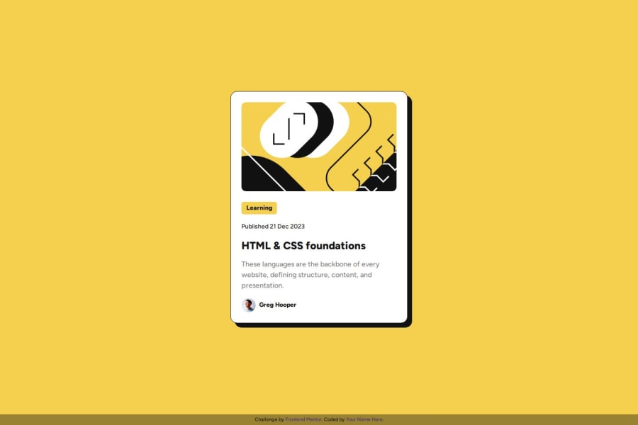
If you allow me to point out something: the box shadow effect when hovering on the card is missing.
Other than that, it's pretty cool and close to the source. Keep it up the good work!
1@kemenyfa-szuPosted about 1 year ago@DanCodeCraft Thank you for checking out my solution and noticing my mistake, I didn't even notice the change of the box-shadow on hovering. Just committed a fix for that.
Thank you again :)
1
Please log in to post a comment
Log in with GitHubJoin our Discord community
Join thousands of Frontend Mentor community members taking the challenges, sharing resources, helping each other, and chatting about all things front-end!
Join our Discord
