

Design comparison

Solution retrospective
I solved some issues from my previous challenge attempt (centring the card nicely in the page using grid, getting Google font API to work in Safari). I'm really happy with the responsive text sizing.
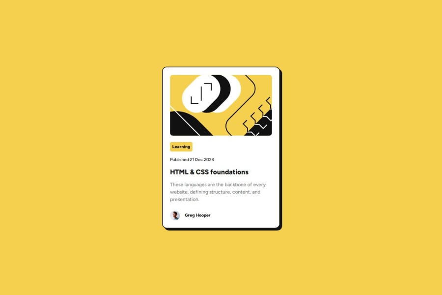
One thing I'm unsure about (although it's minor) is why in the design files the image zooms in, whereas in my solution it simply widens a little bit. Would be interesting to see how others managed the size of the image.
What challenges did you encounter, and how did you overcome them?Getting the Google fonts API to work in Safari was a real learning experience: so many things to go wrong with no real way to test apart from trying it out!
This stack overflow page was very helpful: https://stackoverflow.com/questions/24061808/google-font-not-working-on-safari
Having tried a few things on there, in the end it was replacing '&' with '&' in my link url which solved the problem.
What specific areas of your project would you like help with?I'm interested to see how I could get the image to match the design file in the mobile layout. In my solution, the dimensions are about right, but the image seems zoomed in in the design file.
Community feedback
Please log in to post a comment
Log in with GitHub
Join our Discord community
Join thousands of Frontend Mentor community members taking the challenges, sharing resources, helping each other, and chatting about all things front-end!
Join our Discord