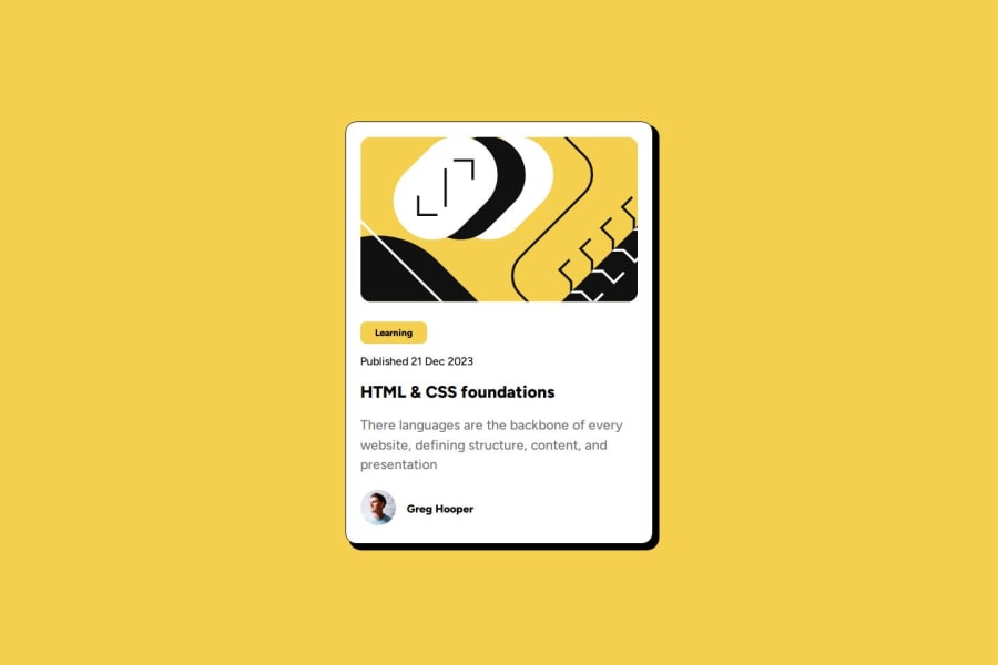
Design comparison
SolutionDesign
Solution retrospective
What are you most proud of, and what would you do differently next time?
I am proud of achieving a new project, and learning/recap some design skills.
What challenges did you encounter, and how did you overcome them?The most challenging part was getting the proper sizing, since I am trying to avoid using Figma.
What specific areas of your project would you like help with?The general structure, and the used CSS.
Community feedback
- @huyphan2210Posted 30 days ago
Hi, @dbachour86
I checked out your solution and I have some thoughts:
HTML:
- I see you're already using some semantic HTML tags, which is great! To enhance this further, consider replacing additional
div
s with other relevant semantic tags (it improves accessibility and SEO). - There's no need to wrap your
h1
andp
tags withindiv
s, as they're already block-level elements, similar todiv
. - It looks like "Learning" is being used as a
button
, but it doesn’t seem like something users would click. Aspan
may be more appropriate. Also, since you’re usingtype="submit"
on thebutton
, keep in mind this attribute should only be used within aform
, astype="submit"
is specifically meant to triggerform
submission. Outside ofform
s,type="button"
is the better choice. - "Published 21 Dec 2023" may not be ideal as a
p
tag. It functions more like alabel
for the heading (in this case, theh1
). You might want to explore howlabel
and heading elements (h1
,h2
, etc.) interact. Additionally, wrapping the date in atime
tag would make it more semantically accurate.
CSS:
- I noticed these styles on
.blog-review
:
.blog-review { // These attributes make .blog-review appeared in the center position: absolute; top: 50%; left: 50%; transform: translateY(-50%) translateX(-50%); /* The following can be removed as child elements are block-level by default */ display: flex; flex-direction: column; justify-content: space-between; align-items: center; }
- It looks like you’re using a media query targeting widths of
480px
or smaller, which aligns with a desktop-first approach. You may want to explore a mobile-first approach instead. - Media queries aren’t the only option for responsive design; try experimenting with CSS relative units (
em
,rem
,%
, etc.), built-in functions (e.g.,calc()
,min()
,max()
, etc.), and relative attributes (min-height
,max-width
, etc.)
Hope this helps!
Marked as helpful0 - I see you're already using some semantic HTML tags, which is great! To enhance this further, consider replacing additional
Please log in to post a comment
Log in with GitHubJoin our Discord community
Join thousands of Frontend Mentor community members taking the challenges, sharing resources, helping each other, and chatting about all things front-end!
Join our Discord