Submitted over 1 year agoA solution to the Blog preview card challenge
Blog Preview Card

@Omarhdez-218
Solution retrospective
What challenges did you encounter, and how did you overcome them?
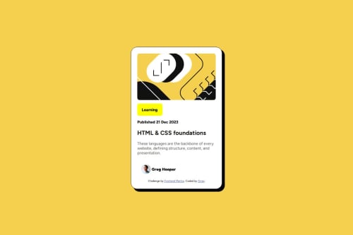
I had a difficult time getting the name "Greg Hopper" & the avatar picture side by side. I overcame that problem by adding a display of inline-block & vertical aligining it to the middle on "Greg Hopper".
Code
Loading...
Please log in to post a comment
Log in with GitHubCommunity feedback
No feedback yet. Be the first to give feedback on Omarhdez-218's solution.
Join our Discord community
Join thousands of Frontend Mentor community members taking the challenges, sharing resources, helping each other, and chatting about all things front-end!
Join our Discord