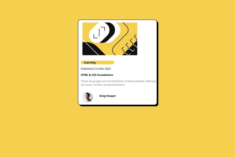
Blog preview card
Design comparison
Community feedback
- @Ezekiel225Posted about 1 year ago
Hello there 👋 @ifeoluwaadegbulugbe.
Good job on completing the challenge !
Your project looks really good!
I have suggestions about your code that might interest you.
📌 First: Use
<main>to wrap the main content instead of<div>.Tags like
<div>and<span>are typical examples of non-semantic HTML elements. They serve only as content holders but give no indication as to what type of content they contain or what role that content plays on the page.📌Using margin is not the best option to center an element. Here's a very efficient (and better) way to place an element in the middle of the page both vertically and horizontally: 📌 Apply this to the body element (in order to work properly, don't use position or margins):
body {
    min-height: 100vh;
    display: flex;  /* it works with grid too  */
    justify-content: center;
    align-items: center;
}
📌If you don't have the Figma design files, I recommend using a browser extension called Perfect Pixel.
It allows you to compare your finished project with the design images that come along when you download the project and check the (almost exact) dimensions. It's very useful!
I hope this suggestion is useful for future projects.
Other than that, great job!
Keep up the excellent work and continue to challenge yourself with new projects. Your progress is impressive, and each project is a step forward in your front-end development journey! 🚀🌟.
Happy coding.
0
Please log in to post a comment
Log in with GitHubJoin our Discord community
Join thousands of Frontend Mentor community members taking the challenges, sharing resources, helping each other, and chatting about all things front-end!
Join our Discord
