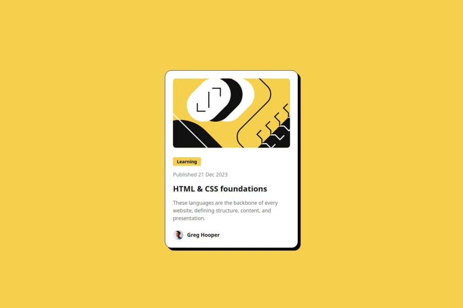
Design comparison
SolutionDesign
Community feedback
- @jeremymouzinPosted 5 months ago
Nice work. Your HTML is semantic and pretty good.
Some things you may want to improve on the design:
- Add a max-width on desktop that matches the design
- The "published" line should be gray-950 not gray-500
- Use the fonts provided by the designer (@font-face to the rescue!)
- Font sizes on mobile are smaller (you may use a media-query or use clamp() to make the font dependant on vw unit (viewport width).
Good luck!
Marked as helpful0
Please log in to post a comment
Log in with GitHubJoin our Discord community
Join thousands of Frontend Mentor community members taking the challenges, sharing resources, helping each other, and chatting about all things front-end!
Join our Discord

