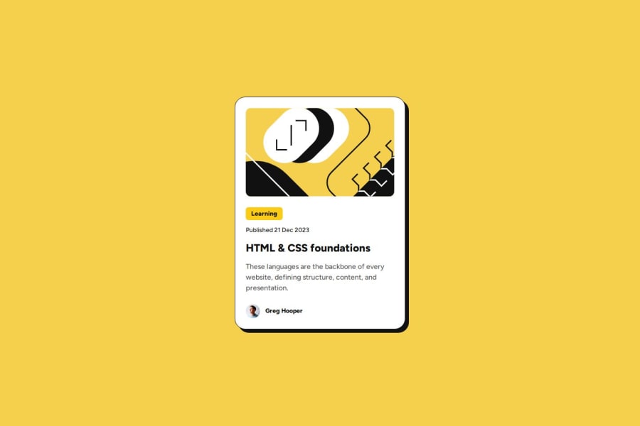
Design comparison
SolutionDesign
Solution retrospective
What are you most proud of, and what would you do differently next time?
Built with. 🔨
- HTML.
- Tailwind.
- Vite.
Features. ✨
- The requirements of the project stated that the font sizes need to slightly change with the screen size, but without using media queries. So I used the
clamp()function on the font size..text-clamp-100 { font-size: clamp(0.75rem, 2vw, 0.875rem); } - To make the whole card clickable, I used a pseudo element. I added the pseudo element to the
ainside theh2. Then made the card componentposition: relative. Now whentop-0right-0bottom-0left-0is given to the pseudo element, it will be same size as the card component. - Added the hover effect to the card component. So when hovered over the card the
box-shadowwill get slightly bigger.
New Things Learned. 🎓
- It's my first time using Tailwind, so had to learn how to setup a project with it.
- Using the the Tailwind CSS IntelliSense VS Code plugin. It was super helpful since it shows the underlying CSS properties for each utility class.
- How to use the
tailwind.config.jsfile to extend the default theme to include my own custom values. - Using
@layerto include my own classes. - When using pseudo elements, Tailwind will automatically add
content: ''by default so you don’t have to specify it unless you want a different value.
Would love some overall feedback on any areas where I can improve.
Community feedback
Please log in to post a comment
Log in with GitHubJoin our Discord community
Join thousands of Frontend Mentor community members taking the challenges, sharing resources, helping each other, and chatting about all things front-end!
Join our Discord
