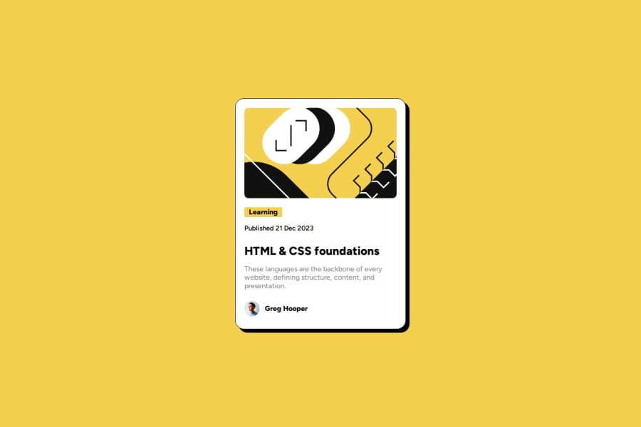
Design comparison
SolutionDesign
Solution retrospective
What are you most proud of, and what would you do differently next time?
Im just proud of finnishing it.And im open to anny suggestions , Tnx!
What challenges did you encounter, and how did you overcome them?1.The challange i had was alligning all, which i used the internet alot.
- On the original , the pointer turns black when you hover the link,i dont know how to make that work.
- The pointer turning black when you hover the link. Id be gratefull for anny help!
Community feedback
Please log in to post a comment
Log in with GitHubJoin our Discord community
Join thousands of Frontend Mentor community members taking the challenges, sharing resources, helping each other, and chatting about all things front-end!
Join our Discord
