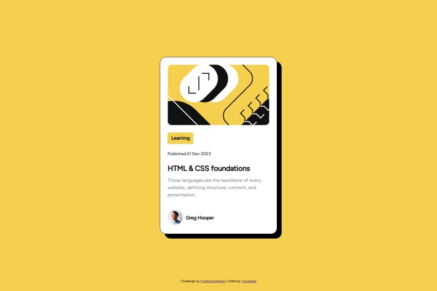
Design comparison
SolutionDesign
Solution retrospective
What are you most proud of, and what would you do differently next time?
I'm just proud I finished it as close as I was able to.
What challenges did you encounter, and how did you overcome them?After I get my card centered up, just getting everything in position. I could definitely do it without using flex, but I am trying to get the hang of it. Some of my flex may be unnecessary as well. I just Googled up some references, either W3School or Mozilla Developer usually. And a lot of winging it
What specific areas of your project would you like help with?I think I have unnecessary lines in my CSS. Looking at it after I uploaded it.
Community feedback
Please log in to post a comment
Log in with GitHubJoin our Discord community
Join thousands of Frontend Mentor community members taking the challenges, sharing resources, helping each other, and chatting about all things front-end!
Join our Discord
