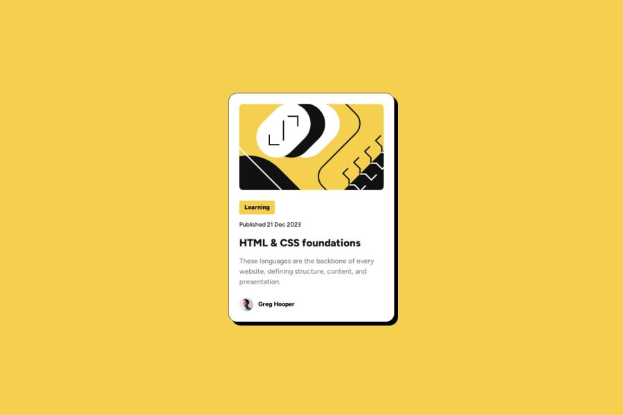
Design comparison
SolutionDesign
Community feedback
- @MohammedOnGitPosted 6 months ago
Hello Lamine
I am so much impressed with your solution. Your code looks clean and well-structured and just pixel-perfect however there here are a few minor suggestions to improve it:
- Accessibility and Alt Text Ensure the alt attribute for the main image (illustration-article.svg) is descriptive for better accessibility.
<img src="assets/images/illustration-article.svg" alt="Article illustration on HTML and CSS foundations">For the author's image, you can be a bit more descriptive as well:
<img src="assets/images/image-avatar.webp" alt="Profile photo of Greg Hooper, the author">- Semantic HTML Instead of wrapping the profile info (card-profile) in a div, you could use the <footer> element, which is more semantic for this section, as it typically contains author or metadata.
<footer class="card-profile">
    <img src="assets/images/image-avatar.webp" alt="Profile photo of Greg Hooper">
    <p>Greg Hooper</p>
</footer>
You did a wonderful job. keep it up.
0
Please log in to post a comment
Log in with GitHubJoin our Discord community
Join thousands of Frontend Mentor community members taking the challenges, sharing resources, helping each other, and chatting about all things front-end!
Join our Discord
