

Design comparison
SolutionDesign

Solution retrospective
What are you most proud of, and what would you do differently next time?
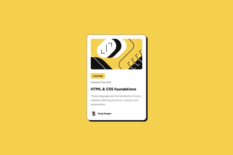
I found it difficult to get the sizes and dimensions correct based on the preview.jpg. I spend the most time going back and forth and adjusting the values of font-sizes etc. Overall it was a fun little project!
Community feedback
- P@kaamiikPosted about 2 months ago
- Wrap
ainside theh1not the opposite.
- The alt should be empty for both images. Do not use words like image or picture inside your alt text. It's obvious that screen reader describing the image. You can read more about how to add a good alt text here: https://www.craigabbott.co.uk/blog/how-to-write-good-alt-text-for-screen-readers/
- Your
font-sizeandmax-widthshould be inremunit notpx. You can read this article about it and why you should not usepxas a font-size.
- No need for this:
width: 100%;
- Use
min-height: 100vh;instead ofheight:100vh;.height: 100vhstrictly limits the height to the viewport size, potentially causing overflow issues if the content is larger than the viewport. On the other hand,min-height: 100vhallows your element to grow in height if the content exceeds the viewport size.
Marked as helpful0 - Wrap


Please log in to post a comment
Log in with GitHubJoin our Discord community
Join thousands of Frontend Mentor community members taking the challenges, sharing resources, helping each other, and chatting about all things front-end!
Join our Discord