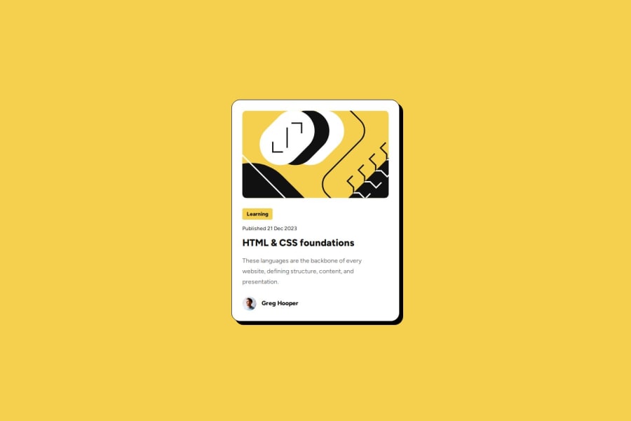
Design comparison
Solution retrospective
After 2/3 years away from web development it was a bit of an issue if best practices had changed. pleased I managed to get through the challenge relatively well, It's not perfect but I'm sure I'll build on it.
I'm pleased I managed to add a few animations on the page to make it a little more unique.
What challenges did you encounter, and how did you overcome them?Second guessing myself when I just have to go with my gut.
What specific areas of your project would you like help with?Check semantic HTML and best practices for images these days as I see some say a fixed width / height on images are now best practice for performance?
I don't like to put a fixed height on the overall article tag so the height won't be exact.
Community feedback
- @KingoruoviePosted 7 months ago
This is such a great work you have done here from the animation to code used. Superb
Marked as helpful0P@Chriseden83Posted 7 months ago@Kingoruovie Thank you, I appreciate it. Still finding my feet relearning things I used to know but getting there.
0
Please log in to post a comment
Log in with GitHubJoin our Discord community
Join thousands of Frontend Mentor community members taking the challenges, sharing resources, helping each other, and chatting about all things front-end!
Join our Discord
