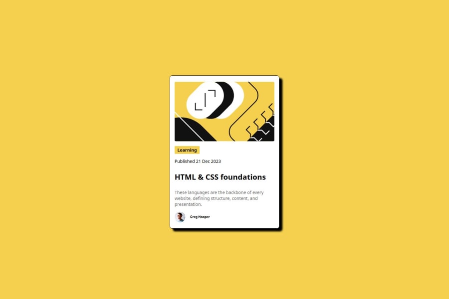


Design comparison

Community feedback
- @Akuma95Posted 8 months ago
You result looks really nice :) Here are some Tips or Inspirations:
- Try to use Variables like:
:root {
   --font-size: 16px;
   --font-weight-normal: 400;
   --font-weight-bold: 700;

   --white: hsl(0, 0%, 100%);
   --Yellow: hsl(47, 88%, 63%);
   --gray-500: hsl(0, 0%, 42%);
   --gray-950: hsl(0, 0%, 7%);

   --space-200: 16px;
   --space-150: 12px;
   --space-100: 8px;
   --space-50: 4px;
}

body {
   background-color: var(--Yellow);
}
If you do this, you can reuse this Color, Spacing, Fontweight, or anything else. An other advantage of it, if the Primary Color changes from Yellow to Red, You can fix it by changing it at one position :)
-
Try to remove unused Code :) if you do this, your code looks better and for other guys its a better overview and they understand your code better.
-
Try to use the Figma File, there is your Design Template and you can see all spaces, fontsizes and so on :) Then you will fit the Design Better with your solution.
But thats all is a good work <3
Marked as helpful0@BravinJoshuaPosted 8 months agoHello does using screen height as 100svh help with blog card not needing to be scrolled into full view? @Akuma95
1


Please log in to post a comment
Log in with GitHubJoin our Discord community
Join thousands of Frontend Mentor community members taking the challenges, sharing resources, helping each other, and chatting about all things front-end!
Join our Discord