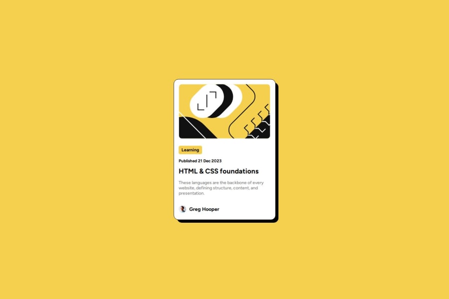
Design comparison
SolutionDesign
Solution retrospective
What are you most proud of, and what would you do differently next time?
I feel proud to be able to create designs that are almost identical to the original, I couldn't do this before. Something I would have liked to do is the animation of the card.
What challenges did you encounter, and how did you overcome them?The big challenge was making the shadow of the design, I solved it by creating a div with a black background and made it appear lower and a little to the right, thus creating the effect.
What specific areas of your project would you like help with?I would like to create designs but using fewer properties in the styles.
Community feedback
Please log in to post a comment
Log in with GitHubJoin our Discord community
Join thousands of Frontend Mentor community members taking the challenges, sharing resources, helping each other, and chatting about all things front-end!
Join our Discord
