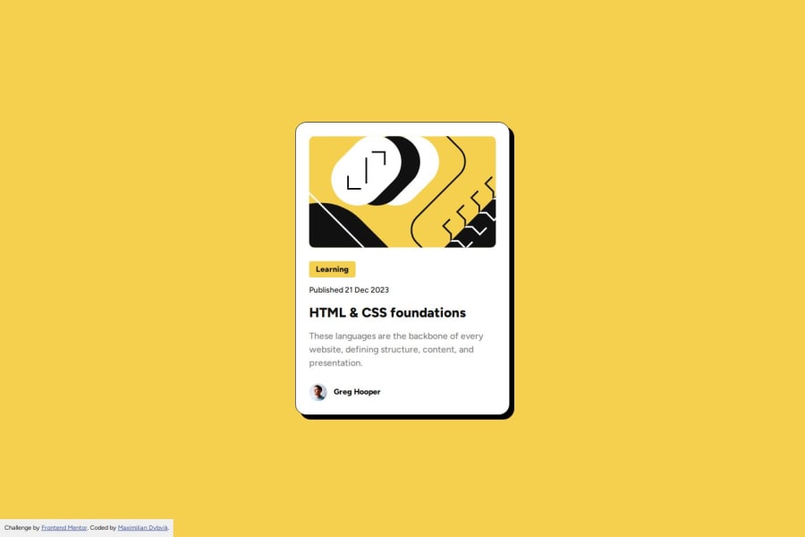
Design comparison
Solution retrospective
My working code is very close to the original design. I also used flexbox to align which I found easier and I would like to use more in the future.
What challenges did you encounter, and how did you overcome them?I wanted to challenge myself to make the fonts scale without using media queries. I did this by using the clamp function:
font-size: clamp(1.25rem, 5.3vw, 1.5rem);
However I found it difficult to get the "preferred size" parameter right.
What specific areas of your project would you like help with?Are my HTML markup semantic and accessible? I used the clamp function to make my fonts size fluid, is there another, maybe better way to do this?
Community feedback
Please log in to post a comment
Log in with GitHubJoin our Discord community
Join thousands of Frontend Mentor community members taking the challenges, sharing resources, helping each other, and chatting about all things front-end!
Join our Discord
