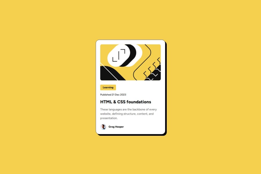


Design comparison

Solution retrospective
Because I have been using Next.js and Tailwind, I am out of practice designing responsively for vanilla HTML and CSS. I am most proud that I figured out how to make the design responsive for mobile.
Next time, I would design mobile first.
What challenges did you encounter, and how did you overcome them?It was challenging to figure out how to change the card title color when hovering over anywhere on the card. This was something I had never done. This is the article that showed me how: How to affect other elements when one element is hovered in CSS?.
What specific areas of your project would you like help with?On mobile, my card image has a shorter height than the Figma file.
Community feedback
- @StroudyPosted about 2 months ago
Exceptional work! You’re showing great skill here. I’ve got a couple of minor suggestions that could make this stand out even more…
-
This doesnt need to be in a
<div><div class="card-category"><p>Learning</p></div> -
Using a full modern CSS reset is beneficial because it removes default browser styling, creating a consistent starting point for your design across all browsers. It helps avoid unexpected layout issues and makes your styles more predictable, ensuring a uniform appearance on different devices and platforms, check out this site for a Full modern reset
-
While
pxis useful for precise, fixed sizing, such asborder-width,border-radius,inline-padding, and<img>sizes, it has limitations. Pixels don't scale well with user settings or adapt to different devices, which can negatively impact accessibility and responsiveness. For example, usingpxfor font sizes can make text harder to read on some screens, Check this article why font-size must NEVER be in pixels. In contrast, relative units likeremand adjust based on the user’s preferences and device settings, making your design more flexible and accessible. Usepxwhere exact sizing is needed, but prefer relative units for scalable layouts. If you want a deeper explanation watch this video by Kevin Powell CSS em and rem explained. Another great resource I found useful is this px to rem converter based on the default font-size of 16 pixel. -
Using
remoremunits in@mediaqueries is better thanpxbecause they are relative units that adapt to user settings, like their preferred font size. This makes your design more responsive and accessible, ensuring it looks good on different devices and respects user preferences.
I hope you’re finding this guidance useful! Keep refining your skills and tackling new challenges with confidence. You’re making great progress—stay motivated and keep coding with enthusiasm! 💻
0@SherrisaPosted about 2 months ago@Stroudy
Thank you for your thorough feedback! I will take some time and dig into these suggestions and update my code.
0 -

Please log in to post a comment
Log in with GitHub
Join our Discord community
Join thousands of Frontend Mentor community members taking the challenges, sharing resources, helping each other, and chatting about all things front-end!
Join our Discord