Design comparison
SolutionDesign
Please log in to post a comment
Log in with GitHubCommunity feedback
- P@monika-webdeveloper
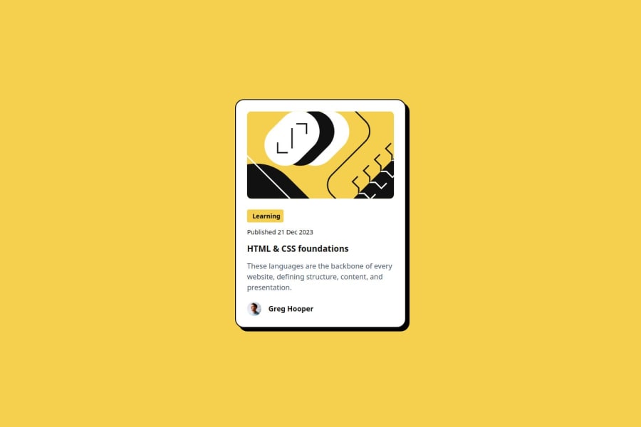
Good job! But your solution slightly differ from the design. I think it's a bit too high. I also think that the HTML shoul be a little simple as there is a paragraph and then a button inside.Is it necessary? I'd also try to use classes more often and stick to lowercases.As sometimes the class name is uppercase, sometimes lowercase or there is no class name.
Join our Discord community
Join thousands of Frontend Mentor community members taking the challenges, sharing resources, helping each other, and chatting about all things front-end!
Join our Discord
