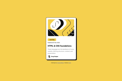
Design comparison
Solution retrospective
My mastery of structures has improved.
What challenges did you encounter, and how did you overcome them?My main problem was with the "Hover" section. I was able to implement it to some extent, but if anyone has a more correct and better solution, please help me. Thanks.
What specific areas of your project would you like help with?hover Section.
Community feedback
- @Bear-FrostPosted 7 months ago
Hello, great job on completing the challenge!
To answer your question, if you are simply trying to center the item element for display, you can give the body a min-height of 100vh so that it covers the entire screen without extending above or below. Then, you can use flex on the body to center the item.
I would also recommend avoiding unnecessary divs to wrap elements. This will help you write cleaner and more well-structured HTML. Try using more semantic HTML tags. Additionally, you should add more meaningful text to the alt attribute of your images, for example, the author's image.
Overall, everything looks good. Just one thing: if you could add a transition to the box shadow after the "HTML & CSS foundations" text receives a hover, that would be great.
Marked as helpful1@m-rooeintanPosted 7 months agoThanks for your help. I will consider the points you said @i-Bex
1 - @m-rooeintanPosted 7 months ago
I used flex to center the card on the page but again it wasn't centered on the vertical axis. Where do you think the problem comes from?
0
Please log in to post a comment
Log in with GitHubJoin our Discord community
Join thousands of Frontend Mentor community members taking the challenges, sharing resources, helping each other, and chatting about all things front-end!
Join our Discord