Design comparison
Community feedback
- P@AbestianPosted 5 months ago
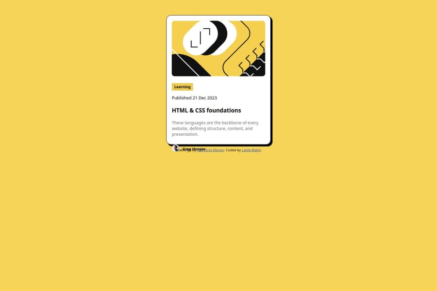
Hey! Great job overall! The card and the code look solid, and you've made a really great job at your solution. There are just a few things to refine, which could elevate the project even further.
What’s working well:
The code is clean and easy to read. The solution is very close to the design, which shows you’ve understood the requirements well.
Suggestions for improvement:
- When using <h$> tags, try to use them in a cascading order from <h1> to <h6>. Currently, the project only uses <h3>, but keeping that hierarchy intact can help with SEO and accessibility.
- It would be a good idea to check the responsiveness across different screen sizes before finalizing. For example, the card looks great between 950px and 1250px, but it could use some adjustments for other screen widths.
- The title could benefit from being wrapped in an <h> tag for semantic HTML. Additionally, adding a hover effect to the title would improve the user experience, and I think it should be treated as a link in this project.
- Don't forget to add values to "alt" attributes inside your <img> tags. It’s essential for accessibility and SEO.
Again, you’re doing really well, and these tweaks will only make your project even stronger. Keep up the good work!
Marked as helpful0 - @Tsuna21182Posted 5 months ago
hola me gusta como nombras las clases lo que yo hice fue definir una clase extra para el contenedor y expecifique el maximo y el minimo en el whidth para que no se desbordara saludos
0
Please log in to post a comment
Log in with GitHubJoin our Discord community
Join thousands of Frontend Mentor community members taking the challenges, sharing resources, helping each other, and chatting about all things front-end!
Join our Discord
