

Design comparison
SolutionDesign

Please log in to post a comment
Log in with GitHubCommunity feedback
- @i000o
Here are some design refinements for you:
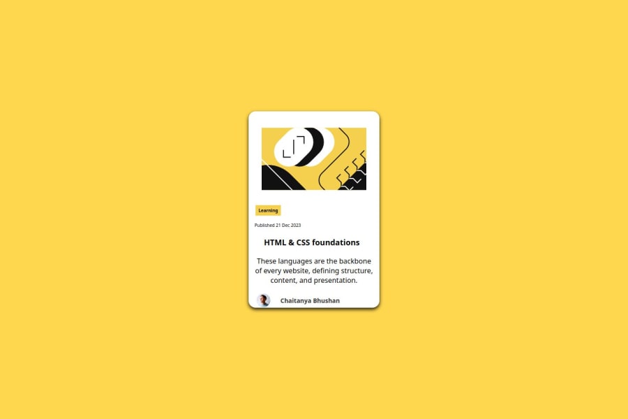
1 You can add some
border-radiuslike you have on the card to the image too in order to match the design closer.2 I believe the font for this design is called 'Figtree' which you can find available anywhere.
3 In order to add a drop-shadow to the card itself, I used the
box-shadowproperty. You can also thicken the border outline withborder-widthtoo. Just a touch.4 You can set all your
bodytext totext align: left.5 Maybe add a bit of
marginto the bottom element so the author name isn't so close to the edge of the card.Marked as helpful


Join our Discord community
Join thousands of Frontend Mentor community members taking the challenges, sharing resources, helping each other, and chatting about all things front-end!
Join our Discord