Design comparison
Solution retrospective
Was happy to do this small project using astro build environment. The documentation provided clear steps on getting a gitlab pages build automatically. Although the project did not require many of the features astro provided, at least this experience will help with future attempts
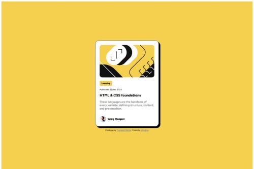
What challenges did you encounter, and how did you overcome them?Was not able to perfectly match the mobile design. In particular, the image will truncate when in the mobile view while preserving the rounded edges.
To get the truncating behaviour, I thought I would need to put the image inside of a div with rounded border that changes size, and use overflow: hidden to visually truncate the image on mobile.
However, when I tried this approach, I could not get the rounded border of the surrounding div to perfectly match the height of the image. Unfortunately I decided the rounded corner on the image was more important than the truncation
What specific areas of your project would you like help with?If anyone has any hints on how to truncate the edges of the image, I would like to hear the secret behind the magic trick :)
Thanks for reading!
Community feedback
- @MikDra1Posted 4 months ago
Nice one @jdcc1024 π
If this comment was useful please mark it as helpful π
Here are tips from me:
To truncate or crop the edges of an image using HTML and CSS, you can use a combination of overflow: hidden; with a container element that has a specific width and height. Hereβs how you can do it:
Method 1: Using a Container with overflow: hidden;
HTML:
<div class="image-container"> <img src="your-image.jpg" alt="Truncated Image"> </div>
CSS:
.image-container { width: 300px; /* Desired width */ height: 200px; /* Desired height */ overflow: hidden; position: relative; } .image-container img { position: absolute; top: 0; left: 0; width: 100%; height: auto; /* You can also adjust the width and height to control how the image is cropped */ }
Method 2: Using object-fit: cover;
If you want the image to automatically scale and crop itself to fit within the container, you can use the object-fit property.
HTML:
If you want the image to automatically scale and crop itself to fit within the container, you can use the object-fit property.
CSS:
.image-container { width: 300px; /* Desired width */ height: 200px; /* Desired height */ } .image-container img { width: 100%; height: 100%; object-fit: cover; /* This crops the image */ }
-
Method 1: The container has a fixed size, and overflow: hidden; hides any part of the image that doesn't fit within the container's dimensions. You can adjust the width and height of the img tag to control the crop.
-
Method 2: object-fit: cover; ensures the image covers the entire container while maintaining its aspect ratio. The image is automatically cropped to fit the dimensions of the container.
Good job and keep going πππ
Marked as helpful1@jdcc1024Posted 3 months agoHey @MikDra1, thank you for taking the time to write out an elaborate, detailed response to my question :)
I hadn't known about object-fit before, but I'm happy to see the div container approach was on the right track. If I understand right, the object-fit corresponds closer to the image fill options seen on Figma and Framer. I'll try giving it a shot in one of the next challenges!
0 -
Please log in to post a comment
Log in with GitHubJoin our Discord community
Join thousands of Frontend Mentor community members taking the challenges, sharing resources, helping each other, and chatting about all things front-end!
Join our Discord