Design comparison
Solution retrospective
I met a target when I have focused on a flex box.
What challenges did you encounter, and how did you overcome them?I'm improving myself, always learning something new.
What specific areas of your project would you like help with?I would like to improve myself with grid.
Community feedback
- @Alexr6667Posted about 1 year ago
Solution looks good. Just keep focusing on making the solution look the same as the design.
Marked as helpful1@Biskup85Posted about 1 year agoThank you for advice, but can you be more specifics which places, it's important to me. @Alexr6667
0@Alexr6667Posted about 1 year agoHi @Biskup85,
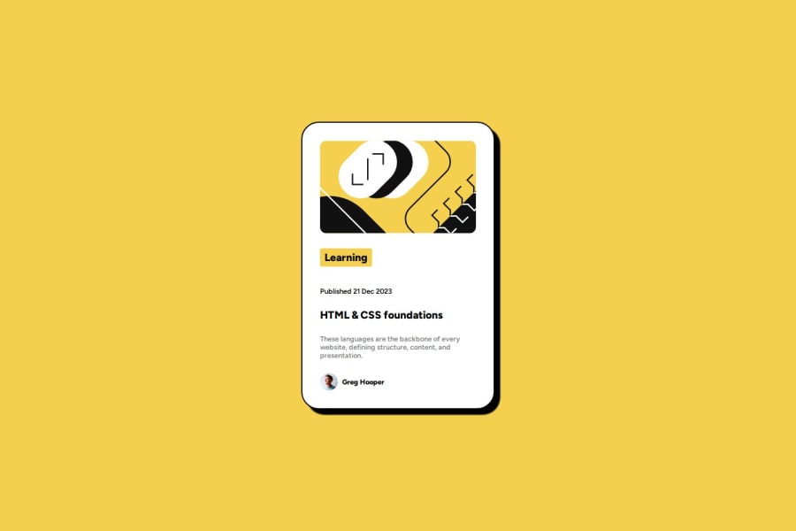
If you notice on your solution compared to the design there are the following differences:
- The design is wider with less internal padding and a smaller border radius.
- The design also has less spacing between the elements and a large font size in for most elements.
It is a really good attempt and you have made it your own. If you do not have access to the Figma files, it makes it a lot harder to make your solution the same as the design.
Marked as helpful1
Please log in to post a comment
Log in with GitHubJoin our Discord community
Join thousands of Frontend Mentor community members taking the challenges, sharing resources, helping each other, and chatting about all things front-end!
Join our Discord
