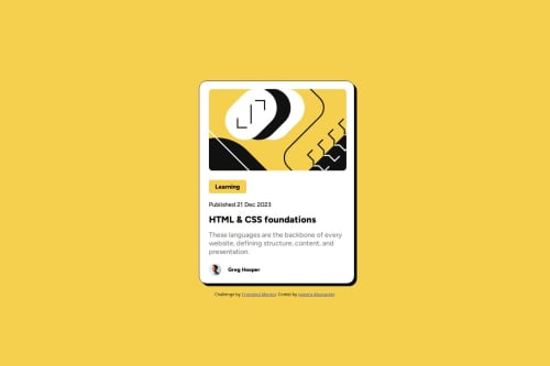
Submitted over 1 year agoA solution to the Blog preview card challenge
Blog preview card
sass/scss, react

@jpmaHub
Solution retrospective
What are you most proud of, and what would you do differently next time?
I am proud of creating a responsive design component.
What challenges did you encounter, and how did you overcome them?Challenges were mainly achieving the responsive design in mobile. I learned them by doing it and understoond how it all worked together. I struggled to align the card to match with the design like center it.
Code
Loading...
Please log in to post a comment
Log in with GitHubCommunity feedback
No feedback yet. Be the first to give feedback on Jaseera Abubacker's solution.
Join our Discord community
Join thousands of Frontend Mentor community members taking the challenges, sharing resources, helping each other, and chatting about all things front-end!
Join our Discord