
Solution retrospective
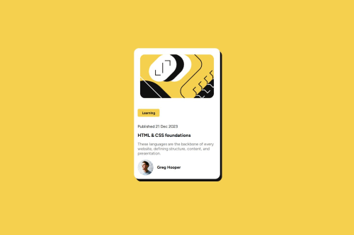
I’m most proud of successfully implementing a responsive design that works well on different devices. It was a great opportunity to put into practice my understanding of CSS Flexbox and media queries, ensuring the layout remained clean and visually appealing across various screen sizes.Next time, I would focus more on optimizing the code for better maintainability. I’d use more CSS custom properties (variables) to make it easier to tweak styles globally and explore using a CSS preprocessor like SASS to organize the stylesheets better.
What challenges did you encounter, and how did you overcome them?I encountered challenges with getting the card layout to adjust smoothly across different screen sizes. Initially, the text and images would overlap or become misaligned on smaller devices. To overcome this, I revisited my understanding of Flexbox and experimented with different flex properties and media queries until I found a solution that maintained the design’s integrity. It was a valuable learning experience in responsive design.
What specific areas of your project would you like help with?I would appreciate feedback on how to further optimize my CSS for performance and maintainability. Specifically, I’m curious if there are more efficient ways to structure my styles or better practices for handling responsive design. Additionally, any tips on improving accessibility would be highly valuable.
Please log in to post a comment
Log in with GitHubCommunity feedback
No feedback yet. Be the first to give feedback on Tanuja0530's solution.
Join our Discord community
Join thousands of Frontend Mentor community members taking the challenges, sharing resources, helping each other, and chatting about all things front-end!
Join our Discord