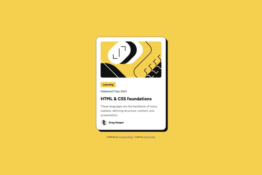


Design comparison
SolutionDesign

Solution retrospective
What are you most proud of, and what would you do differently next time?
- It looks very close to the design.
- Page is responsive.
- Font size changes as you decrease the screen size making it more responsive.
- In this problem I learned how to use media querries to make your design more responsive. It is one step ahead of using the units that scale with the screen and browser settings.
What specific areas of your project would you like help with?@media only screen and (max-width: 380px) { .card-tag, .card-date { font-size: 1.2rem; } .card-title { font-size: 2rem; } .card-desc { font-size: 1.4rem; } }
I want to find ways I can reduce the amount of the css that I am needing to write. If there's any way them do let me know, thanks in advance.

Join our Discord community
Join thousands of Frontend Mentor community members taking the challenges, sharing resources, helping each other, and chatting about all things front-end!
Join our Discord