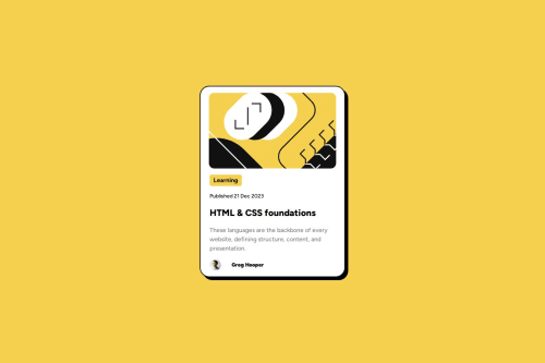
Design comparison
Solution retrospective
I believe I have a largely accurate page that gets dimensions right and is minimally responsive.
What challenges did you encounter, and how did you overcome them?Trying to figure out how to lay out elements on the page, things like centering a div vertically and horizontally inside of a container.. also importing and working with google fonts. I am still getting used to figma files.
What specific areas of your project would you like help with?I made classes for every bit of text so I have full control over positioning, font weight, etc... but I am wondering if a better approach exists.
Community feedback
- @Grimm-NPosted 6 days ago
You're doing fantastic—seriously, great work! 👏✨ I love seeing how much effort you're putting into this. Here are a few suggestions to refine your approach even more:
1️⃣ Instead of pixels, try using relative units like
em
,rem
, or%
. They make your design more flexible and responsive to different screen sizes, which is essential in modern web development. 🌍2️⃣ When naming your classes, following the BEM (Block-Element-Modifier) methodology can be super helpful. For instance:
<div class="card"> <div class="card__header">Header</div> <div class="card__body">Content</div> <div class="card__button card__button--active">Button</div> </div>
This keeps your code clean, easy to understand, and scalable. Future-you will appreciate it! 🙌
3️⃣ I noticed you have some inline styles in your HTML. These are great for quick tests, but if you already have a separate CSS file, move them there or delete them for cleaner, more organized code. 🧹
You're on the right track—keep it up! Your projects are going to look incredible! 🎉
1 - @dylan-dot-cPosted 7 days ago
Well done with this challenge! Everything looks perfect!
I do find that you using the global class is a bit of an overuse, especially with what you use it for,
margin-left
andmargin-top
. I think it's essentially a padding you are trying to replicate. So basically you can have 2 main divs in the card. The image wrapper and the content/body wrapper. On the card container put a padding of 16px or 1rem.(I suggest you use rem over px in most cases). That would eliminate the need for the margin-left. Make sure the padding is on all sides, not just left/right but also top and bottom.For the margin-top you can make the second div a flex with flex-direction column and then put a gap of 1rem, that will give you the spacing that you want.
I also found it weird you have an empty global div for the extra space at the bottom, which is actually the padding for the card. It's not necessary a bad practice by itself as an empty div is used in bootstrap to help with layout columns and used as a divider between content(not gap but kinda like it). Anyways a padding on your .container should fix most of your uses.
Also for the css resets, if you have that much you can put it in a separate file(my thoughts might not be best practice) and import it into main.css.
Overall I think you have too much css code and I find it weird how you use global in the css and HTML code. Also you could look at using css variables for the colors but it could be good for fonts and spacing as well.
0
Please log in to post a comment
Log in with GitHubJoin our Discord community
Join thousands of Frontend Mentor community members taking the challenges, sharing resources, helping each other, and chatting about all things front-end!
Join our Discord