

Design comparison

Solution retrospective
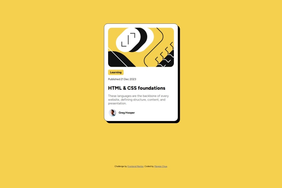
I think I'm most proud of the learning tag on the blog preview card. I was stuck at first on how to go about it, but after thinking about what I knew about CSS layouts as well as experimenting, I was able to determine a solution. I don't think there's anything in particular for this project that I would've done differently, but I think that reviewing accessibility best practices is something I need to invest more time into.
What challenges did you encounter, and how did you overcome them?I faced several challenges with styling, which included targeting specific paragraph elements (since some of them have different font colors), the learning tag, and formatting the creator. I think the main thing that helped was reviewing the documentation and web.dev articles on the topic until I felt like I had an idea of what I could use to achieve the results I was looking for.
What specific areas of your project would you like help with?I would like to get feedback on how I could improve accessibility on my project as well as what I could do to structure it better. In terms of CSS, I would like some feedback on my use of selectors and how I formatted my components (whether there are better/more efficient ways to do so). Thanks!
Community feedback
Please log in to post a comment
Log in with GitHubJoin our Discord community
Join thousands of Frontend Mentor community members taking the challenges, sharing resources, helping each other, and chatting about all things front-end!
Join our Discord