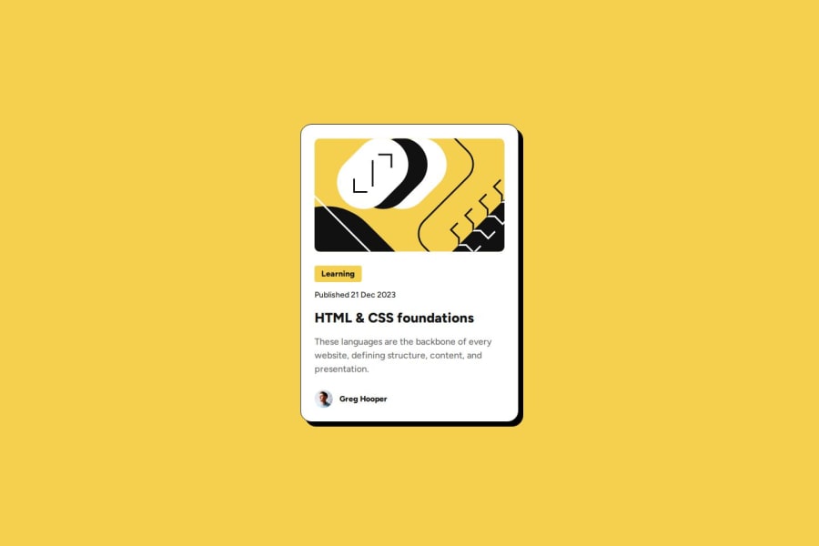
Design comparison
SolutionDesign
Solution retrospective
What challenges did you encounter, and how did you overcome them?
I replaced 'media queries' with font-size: clamp().
Community feedback
- @StroudyPosted about 2 months ago
Hello again, Incredible work on this! You’re making great strides, and I have a couple of suggestions that might push it even further…
- Your heading elements
<h1><h3><h2>, Heading elements should be in sequentially-descending order (e.g.,<h1>,<h2>,<h3>) to create a clear content structure, improving accessibility and SEO. Skipping levels or using them out of order can confuse screen readers, affect search engine rankings, and make your content harder to understand.
<h3 class="blog-category">Learning</h3> <h2 class="blog-title">HTML & CSS foundations</h2>- I think you can benefit from using a naming convention like BEM (Block, Element, Modifier) is beneficial because it makes your CSS more organized, readable, and easier to maintain. BEM helps you clearly understand the purpose of each class, avoid naming conflicts, and create reusable components, leading to a more scalable codebase. For more details BEM,
You smashed this task and it is nice to see some changes I suggested previous! You’re doing so well, and I hope this feedback is helpful! Keep honing your skills and remember to enjoy the process—you’re on a great path. Stay motivated, and happy coding! 🎯
Marked as helpful1 - Your heading elements
Please log in to post a comment
Log in with GitHubJoin our Discord community
Join thousands of Frontend Mentor community members taking the challenges, sharing resources, helping each other, and chatting about all things front-end!
Join our Discord
