Design comparison
SolutionDesign
Solution retrospective
What are you most proud of, and what would you do differently next time?
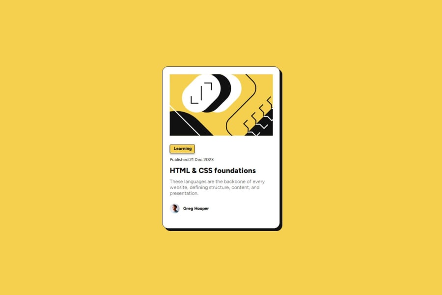
Simple blog preview card. The aspect most proud of was being able to navigate and utilize Figma to create the proper sizing for fonts, padding, margin, and gaps.
What challenges did you encounter, and how did you overcome them?Biggest challenge was trying to use size the SVG image for mobile responsiveness. The SVG is still not the proper size on mobile.
What specific areas of your project would you like help with?Figuring out the proper process to resize SVG for mobile without breaking.
Community feedback
Please log in to post a comment
Log in with GitHubJoin our Discord community
Join thousands of Frontend Mentor community members taking the challenges, sharing resources, helping each other, and chatting about all things front-end!
Join our Discord
