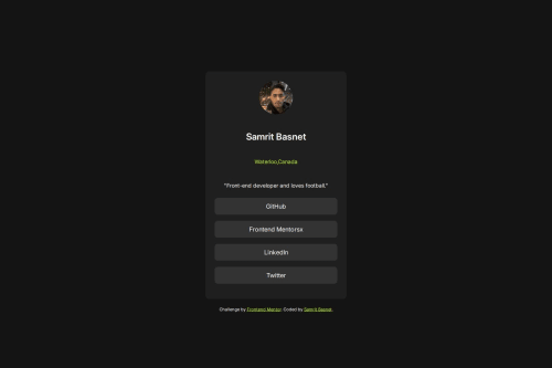
Submitted over 1 year agoA solution to the Social links profile challenge
Blog Preview Card
@samritbasnet

Solution retrospective
What are you most proud of, and what would you do differently next time?
I am happy to finish the project although it took some time to understand about pseudo selector i had to do some research online about it. I am happy that its working now and the final design looks lot similar.
What challenges did you encounter, and how did you overcome them?I had challenges with pseudo selector selection and add hover effect for the child class.
Code
Loading...
Please log in to post a comment
Log in with GitHubCommunity feedback
No feedback yet. Be the first to give feedback on samritbasnet's solution.
Join our Discord community
Join thousands of Frontend Mentor community members taking the challenges, sharing resources, helping each other, and chatting about all things front-end!
Join our Discord