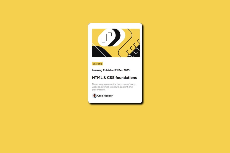
Design comparison
Please log in to post a comment
Log in with GitHubCommunity feedback
- P@Islandstone89
HTML:
-
Every webpage needs a
<main>that wraps all of the content, except for<header>andfooter>. This is vital for accessibility, as it helps screen readers identify a page's "main" section. Change.containerinto a<main>. -
I would use the
<img>element for the top image. -
"Learning" is not a button, but a paragraph. Give it a
display: inline-blockand somepadding. -
Remove "Learning" in front of the published date. The published date is also a
<p>, and I would wrap the date in a<time>element:<p>Published <time datetime="2023-12-21">21 Dec 2023</time></p>. If it were a heading, it could not be a<h4>, as headings must always be in order. -
As this is a blog card, the heading needs a link inside.
-
Do not use words like "image" in the alt text. Screen readers start announcing images with "image", so an alt text of "authors image" would be read like this: "image, authors image". Change it to "Headshot of Gary Hooper".
-
Make "Gary Hooper" a
<p>.
CSS:
-
Including a CSS Reset at the top is good practice.
-
Add around
1remofpaddingon thebody, so the card doesn't touch the edges on small screens. -
Move the properties on
.containerto.card. Removedisplay: flexand themargin, as well as thewidthandheight. -
Add a
max-widthof around20remon the card, to prevent it from getting too wide on larger screens. -
To center the card horizontally and vertically, I would use Flexbox on the body:
display: flex; flex-direction: column; justify-content: center; align-items: center; min-height: 100svh;-
Except for the profile image, remove all widths.
-
font-sizemust never be in px. This is a big accessibility issue, as it prevents the font size from scaling with the user's default setting in the browser. Use rem instead. -
Images needs
display: blockandmax-width: 100%- the max-width prevents overflowing of the container. Add someborder-radiusin eitherremorpx. -
I'm not sure you need a media query for this challenge. Remember to have them in rem instead of
pxwhen you use them.
-
Join our Discord community
Join thousands of Frontend Mentor community members taking the challenges, sharing resources, helping each other, and chatting about all things front-end!
Join our Discord
