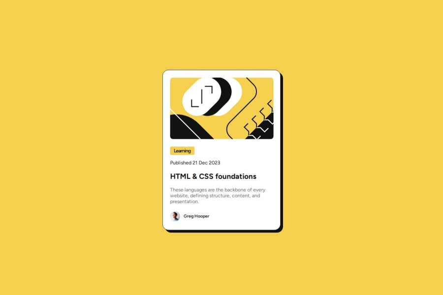
Design comparison
SolutionDesign
Solution retrospective
What are you most proud of, and what would you do differently next time?
using figma to get design details like border radius and card sizing
What challenges did you encounter, and how did you overcome them?working with variable fonts, doing research and trying things out
What specific areas of your project would you like help with?typography still isn't quite exact. Had to make the letter spacing -1 at one point to make it look more like the real thing. Even though the design said letter spacing should be 0px
Community feedback
Please log in to post a comment
Log in with GitHubJoin our Discord community
Join thousands of Frontend Mentor community members taking the challenges, sharing resources, helping each other, and chatting about all things front-end!
Join our Discord
