

Design comparison

Solution retrospective
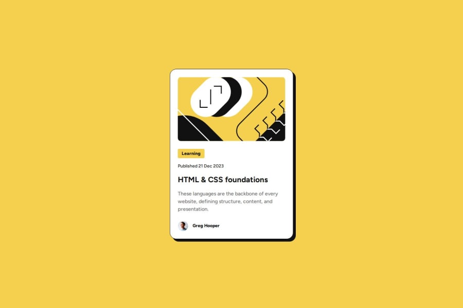
J'ai réalisé ce projet avec une structure HTML simple et logique. J'ai également essayé de minimiser le CSS. Je m'efforce d'appliquer les bonnes pratiques.
Je remercie d'avance ceux qui prendront quelques minutes pour me faire un retour sur ce travail.
I created this project with a simple and logical HTML structure. I also tried to minimize the CSS. I strive to follow best practices.
I would like to thank in advance those who take a few minutes to give me feedback on this work.
Community feedback
- @ikokoliusPosted about 1 month ago
I'm also a beginner :-)
It is a good solution, but you seem not to take into account the mobile version. I wonder also what is the purpose of classes like .text-preset-1, they are not used at all, especially as you are trying to minimize CSS. Also you can try to use semantic HTML.
Marked as helpful0@Matt1208DevPosted about 1 month ago@ikokolius You're absolutely right, Iryna. I modified my CSS but didn't remove the unused classes. Regarding the semantic HTML you mentioned, do you have an example to share?
Thank you very much for your feedback.0@ikokoliusPosted about 1 month ago@Matt1208Dev
Semantic HTML means you use main, header, footer, article and so on elements instead of divs. It's good to wrap all your page content in main element, for the card you could use article, which can have header containing for example image and heading and also footer with author info.
Marked as helpful0

Please log in to post a comment
Log in with GitHubJoin our Discord community
Join thousands of Frontend Mentor community members taking the challenges, sharing resources, helping each other, and chatting about all things front-end!
Join our Discord