Design comparison
Solution retrospective
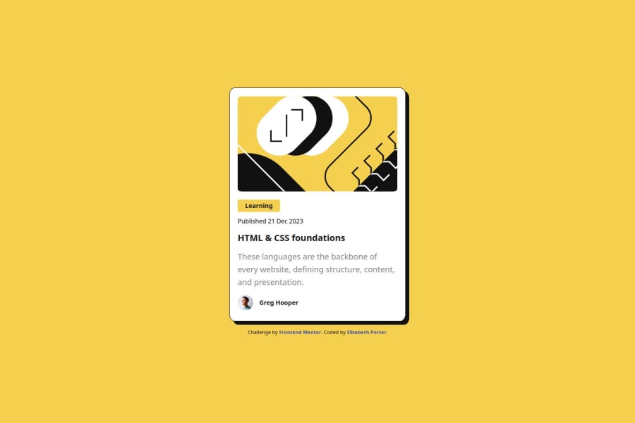
I'm proud of the work I put into project from the HTML to the CSS. I've made improvements in my understanding of Flexbox.
What challenges did you encounter, and how did you overcome them?I've felt challenged to apply what I've learned. I rewrote the code multiple times to simplify it. Each revision seemed improved. I'm working on solidifying the fundamentals.
What specific areas of your project would you like help with?I would appreciate comments on the fundamentals of this project. My design is 'taller' than the solution. Any tips on solving this issue would be greatly appreciated. Thank you.
Community feedback
- @ClipzoramaPosted 6 months ago
Hello!
Great job on your project they look nearly identical! Just a couple thing:
Height Differences: The height of the card in the solution is taller compared to the design. You might want to adjust the flexbox properties or set a consistent min-height or max-height to match the design more closely.
Margins and Spacing: The overall spacing, especially around the card, seems different. In the design, there's a more balanced margin between the card and the surrounding container. Double-check the margin and padding values to ensure they reflect the design’s layout.
Element Size and Proportion: The size of the text and the image in the solution appear slightly larger compared to the design. Consider adjusting the font-size and image dimensions to ensure they match the proportions in the design.
Marked as helpful0
Please log in to post a comment
Log in with GitHubJoin our Discord community
Join thousands of Frontend Mentor community members taking the challenges, sharing resources, helping each other, and chatting about all things front-end!
Join our Discord
