Not Found
Not Found
Not Found
Not Found
Not Found
Not Found
Not Found
Not Found
Not Found
Not Found
Not Found
Not Found
Not Found
Not Found
Not Found
Not Found
Not Found
Not Found
Not Found
Not Found

Submitted

Blog preview card

@MazontheMoon

Desktop design screenshot for the Blog preview card coding challenge

This is a solution for...

  • HTML
  • CSS
1newbie
View challenge

Design comparison


SolutionDesign

Solution retrospective


What are you most proud of, and what would you do differently next time?

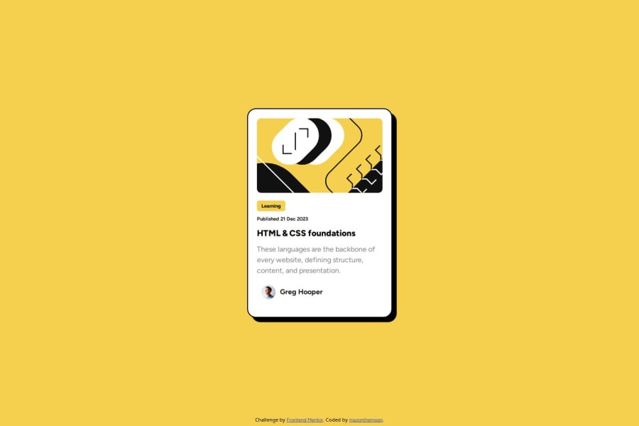
I really enjoyed but found challenging trying to exactly match the provided image

What challenges did you encounter, and how did you overcome them?

I am not very experienced using figma to get specifics such as the border-radius size, etc so I eyeballed the image instead and will be following a few figma tutorials to prepare for the next challenge.

What specific areas of your project would you like help with?

I would be interested in knowing if there are any best practices that I should be following....or bad habits I need to break?

Community feedback

P
beowulf1958 1,170

@beowulf1958

Posted

Congratulations on completing this challenge. It looks great and is responsive. Good job!

As to better practices, you might consider simplifying your resets. Setting the body tag margin:0 ; padding:0 then a few lines down body * also margin: 0; padding: 0; is redundant and unnecessary. The same effect with all the resets as a whole can probably be done done by shrinking those style done. For example: h1, p, a tags will inherit the styles of the parent. If the font-family is set on the body tag, then you would only need to declare the styles which deviate from the main style. Often times the cascade and inheritance will do your work for you. If you truly need a complete stripping of browser styles, perhaps loading a reset.css before your main styles. Josh Comeau has a popular one here.

As to bad habits, under .card .publish-date styles you declare font-weight 500; then font-weight: bold; two lines later. The second style overwrites the first. Remember: the best line of code you write is the one you don't write. The most simple code that does the job is the best practice.

Last but not least, you forgot to add a hover state to the card title as shown in the design file. The h1 turns yellow when you hover over it.

I do love that you comment your css; this makes it easier to parse--and easier to maintain later on. Look forward to see what you do next! Keep on coding.

Marked as helpful

0

@MazontheMoon

Posted

Thanks so much for taking the time to check that out :) @beowulf1958 I can't believe I missed the hover state so I will fix that up and will read up some more on css resets.

0

Please log in to post a comment

Log in with GitHub
Discord logo

Join our Discord community

Join thousands of Frontend Mentor community members taking the challenges, sharing resources, helping each other, and chatting about all things front-end!

Join our Discord