

Design comparison

Solution retrospective
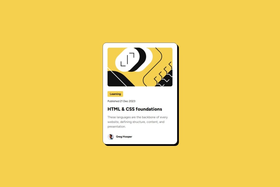
I am most proud of successfully implementing a clean and responsive blog preview card that closely follows the given design. The typography, spacing, and hover effects create an engaging user experience, and the use of flexbox and CSS properties helps maintain a structured layout.
If I were to improve this project, I would:
- Enhance accessibility by ensuring proper use of semantic elements (
<article>instead of<div>for content, and replacing<author>with<div>or<span>as<author>is not a valid HTML element). - Refactor CSS to reduce redundancy, such as combining common styles into reusable classes.
- Optimize the hover effect by adding a smooth transition for color changes.
- Challenge: The article title changes color on hover, but it felt abrupt.
- Solution: Adding
transition: color 0.3s ease-in-out;would create a smoother effect.
- Challenge: The given design does not provide exact measurements for spacing and typography.
- Solution: Used
line-height: 150%for text readability and scaled the font sizes appropriately based on screen width.
- Challenge: The author avatar styling used
border: 100%;, which does not work for rounding an image. - Solution: Replacing it with
border-radius: 50%;properly makes it a circular avatar.
I would appreciate feedback on the following areas:
-
CSS Structure & Optimization:
- Are there ways to improve my CSS organization to make it more maintainable?
- Would CSS variables be beneficial for managing colors and spacing?
-
Responsive Design Enhancements:
- My media query adjusts font sizes and layout, but is there a more efficient way to handle responsiveness?
- Should I consider using CSS clamp() or
remunits instead of fixedpxvalues?
-
Best Practices for Semantic HTML:
- Are there any semantic improvements I should make to improve SEO and accessibility?
- Would adding ARIA attributes help in making the blog preview card more inclusive?
Any feedback or suggestions are greatly appreciated! 🚀
Please log in to post a comment
Log in with GitHubCommunity feedback
- @Srujana-devi
What You Did Well:
Successfully implemented a clean, responsive design with engaging UX.
Effective use of Flexbox for layout structuring.
Thoughtful improvements, such as hover transitions and image styling fixes.
Areas for Improvement:
CSS Optimization: Refactor redundant styles and consider using CSS variables for colors & spacing.
Responsiveness: Utilize rem, or em for font sizes instead of fixed px values.
Semantic HTML: Use <article> for content instead of <div>, and ensure proper ARIA attributes for accessibility.
Transitions & Effects: Optimize hover effects with smooth animations for a polished user experience.

Join our Discord community
Join thousands of Frontend Mentor community members taking the challenges, sharing resources, helping each other, and chatting about all things front-end!
Join our Discord