

Design comparison
SolutionDesign

Solution retrospective
What are you most proud of, and what would you do differently next time?
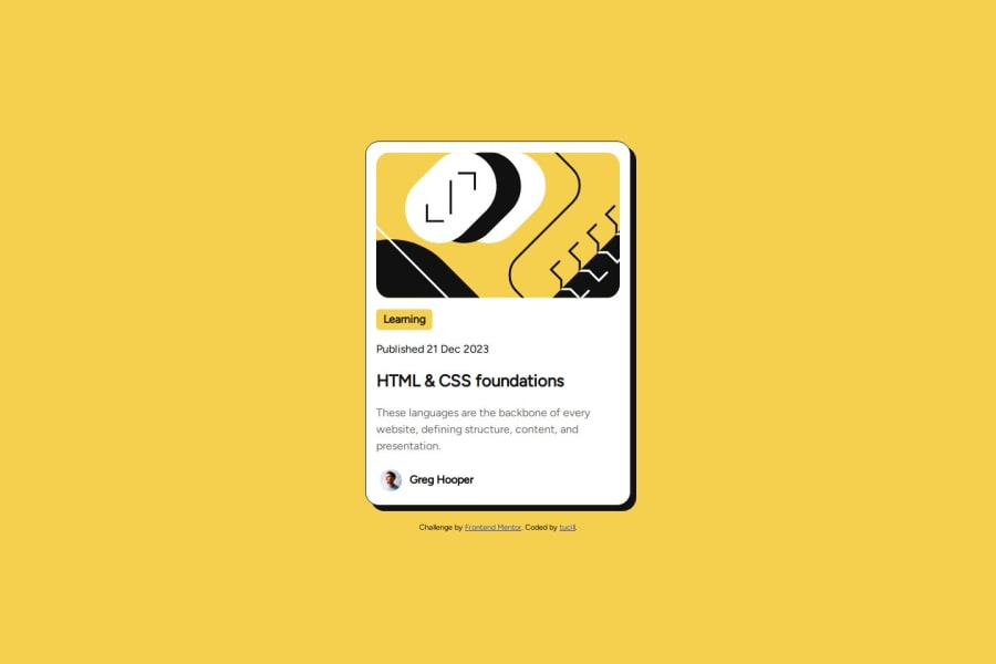
Create a website blog preview card
What challenges did you encounter, and how did you overcome them?Create a blog preview
- HTML
- CSS
Responsive
Community feedback
- @grace-snowPosted 4 months ago
This is missing some important fundamental understandings in the html.
- this is a card component demo. It's fine to use the article tag but this still should be inside a main landmark on the page. The attribution should be in a footer landmark
- main should not be inside this card.
- the card image doesn't need wrapping in a div nor does the text content of the card. Keep the html as simple as possible as a general rule.
- the images in this are decorative so should have empty alt. I recommend you look up Craig Abbot's article about how and when to write alt text on images. Alt text should never include words like "image" as they are already on an image role element.
- mark is for highlighted text in paragraphs. It's not for tags/categories on blog cards. That's just a paragraph.
- don't use br elements unless you have no other choice. These will be announced as "break!" By some screen readers. The time elememt can go inside a paragraph or be set to display block so it sits on its own line.
- the datetime attribute value must not include spaces.
- the most important point of all in this challenge is you've missed off the element that makes this blog card functional. The whole purpose of this card is to signpost site visitors to a particular blog post. That means there must be a link in there! The design shows this card is meant to be clickable so you know there needs to be a link. This belongs inside the card heading, so the blog name is the link text.
- to make the whole card clickable, add a pseudo element to that link when you add it. The cars should be position relative and the pseudo should be positioned absolute and cover the whole card.
- the address element isn't appropriate for the card footer. That's just a paragraph or a div with img and paragraph inside.
With CSS :
- get into the habit of including a full modern css reset at the start of the styles in every project you do. What you have at the moment is not a full css reset. Look up Andy Bell's modern css reset to learn more and use that or a similar one.
- never limit the height of elements that contain text including the body. Use min-height not height on that so the body is allowed to grow taller than the screen when it needs to. (This is causing a bad bug on smaller screens)
- Similarly, the card must not have a max height. That will make the component break in many scenarios like users change font styles or size; or authors change amount of content or a blog has a long description/title.
- make sure you are intentional about unit choice. It's unlikely you'd want to use rem for the card padding. When a user has a larger text size setting in their browser or device it could make the card's inner content area very narrow. Often px are preferred for that or a min() css function.
- don't nest css selectors unnecessarily. This drastically increases css specificity and makes css very difficult to manage on larger/real projects. Stick to single class selectors as much as possible.
- never add hover pointers when you've not got an interactive element. That should ring alarm bells straight away that something won't work for keyboard or other modalities if there's no interactive elements.
Marked as helpful0@tucillPosted 4 months ago@grace-snow Thank you for your input, this is very useful, I will improve and maximize it as much as I can
0 - P@sam-xvPosted 4 months ago
Looks good
0


Please log in to post a comment
Log in with GitHub
Join our Discord community
Join thousands of Frontend Mentor community members taking the challenges, sharing resources, helping each other, and chatting about all things front-end!
Join our Discord