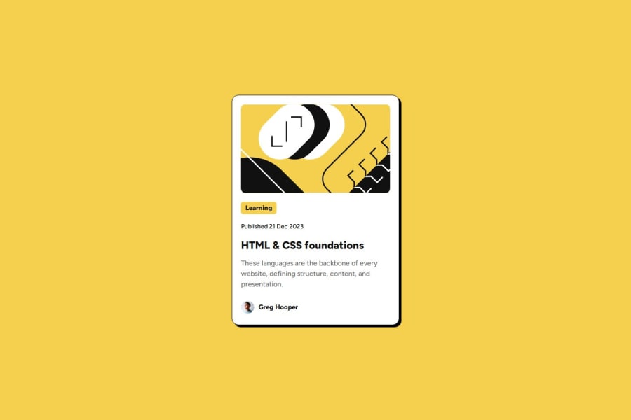
Design comparison
Community feedback
- @ansarstellarPosted 3 months ago
Yes, the solution uses semantic HTML elements such as <h6> for headings and <img> for images. Partially accessible: The solution could be improved by adding alt text to the image to make it more accessible for screen readers, especially for visually impaired users. In the current code, the alt text is very generic ("Placeholder Image"), and it should be more descriptive. While the code works well on large screens due to the flex layout, smaller screens may face issues if the image is too wide. Adding media queries to adjust the image size and padding/margin based on screen width would improve the design’s responsiveness.
0
Please log in to post a comment
Log in with GitHubJoin our Discord community
Join thousands of Frontend Mentor community members taking the challenges, sharing resources, helping each other, and chatting about all things front-end!
Join our Discord
