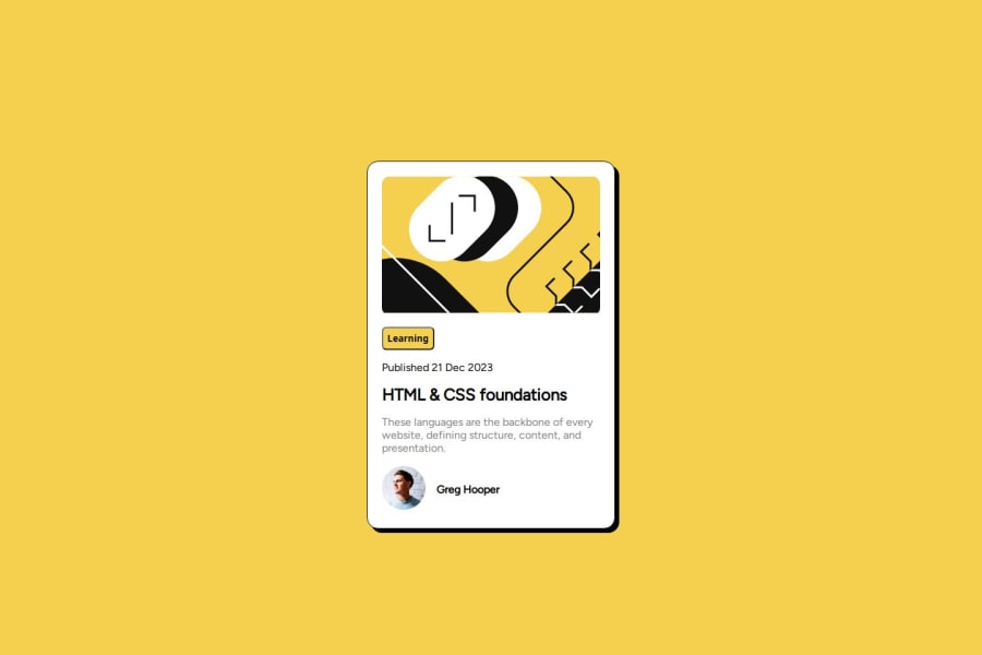
Design comparison
Solution retrospective
I would like to learn good CSS practices
Please log in to post a comment
Log in with GitHubCommunity feedback
- @grace-snow
Hi,
I'm afraid there's some problems in this that you'll need to fix before moving onto anything else.
- all content should be contained within landmarks. This needs a main landmark to wrap around the component. Although this isn't a real webpage and it's just a single component demo it's still a good practice to include the landmark so that you don't forget later on when you come to build webpages.
- keep the HTML as simple as possible. Remove the extra divs around the images, the mid-container div, and the div around the author name.
- Learning is not a button. It's just a category for the blog. This should just be a paragraph Element.
- you've missed probably the most important feature in the HTML for this challenge. You must always think through the content carefully when choosing which elements to use. Think. What is this card? What is its purpose? What hover styles does the design show? The answers to all of those questions should lead you to know that this card serves as a sign post, a link to a blog. But you've not included a link anywhere! Place the link inside the h2 wrapping the title text.
- once that's done you need to make the whole card clickable in this case so it matches the design. To do that make the card position relative and then add an absolutely positioned pseudo element to the link. This can be sized and positioned absolutely so that it covers the card.
- don't ever limit the height of elements that contain text including the body. Because you've placed
height: 90dvhon the body it's causing content to get cut off for some users for example on small screens or landscape. Instead use min-height. That tells the browser that the body is allowed to grow Beyond the confines of the viewport height when it needs to. - the component must not have a width. Instead set a max width in rem. This allows the card to grow up until the limit you've set but also to shrink narrower when it needs to like on small phones. By using rem it means the layout will scale nicely for all users including those who have a different size setting.
- there is no need for a media query in this, you can remove it.
- get into the habit of always including a full modern CSS reset at the start of the styles in every project you do. Because this is missing your images are behaving strangely. They don't always take up the space they should and display inline when they should be block. Simply including the reset will fix this.
- give the author image an explicit width and height (this can be in pixels if you want).
- be certain what unit you want to use for the padding on the card. I would probably use pixels there, using means that that would increase if the users text size was increased. That could lead to some very narrow content. Whereas using pixels means the padding would stay fixed.
- I think you're really misunderstanding the difference between padding and margin by looking how you're using it at the moment. I recommend you read the post on my website about this. Elements like headings and paragraphs shouldn't really have padding. It's margin that should be creating the vertical space between them.
- on a similar note in the bottom section where you're using flex box that is the time to use the gap property to create the horizontal space between image and text.
- your heading text doesn't look like the design at the moment. Make sure you're using the correct font and weight.
I hope this has been helpful.
Marked as helpful - @sivalingamr2001
Useful for card desing
- @valentyyyyn
so cool
Join our Discord community
Join thousands of Frontend Mentor community members taking the challenges, sharing resources, helping each other, and chatting about all things front-end!
Join our Discord
