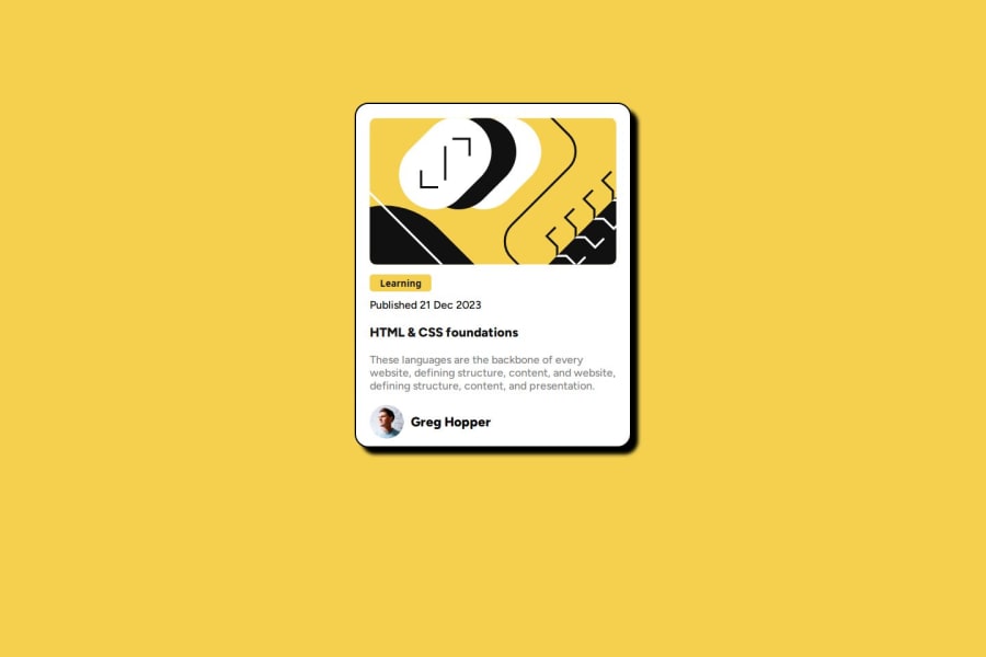
Design comparison
SolutionDesign
Community feedback
- P@kaamiikPosted 6 months ago
Hi. I have some notes that I wanna mention:
- There is no need to use
articleandsectiontag here. It's Just a card and can be deployed using adivtag`. - Your
imgis decorative and does not need any alt text message. - I think Learning is not a button and can be
atag because It takes you to the new page if It is a tag. - You can not use a text inside a
div. Try a semantic tag likep. - It's not necessary to wrap everything in a
div. Do it when you have to. - Still I see some other problems. Better to revisit your html.
- On CSS, You need a good CSS reset. Andy Bell is good.
- Your page is not responsive. If you resize the screen size it overflows. Because you restricted your
widthandheight. Never ever do this. You can do this only for some image and logos. - You have to use
remunit for font size and also for spacing you can useemtoo. and also for usingmax-widthand media query you have to useremunit.
0@PichikachanduPosted 6 months ago@kaamiik thank you for your clarification iam just a beginner I will rectify those mistakes
1P@kaamiikPosted 6 months agoYw :) Try to ask more question on discord community If you are hesitate in some part of your code. Mentors can help much better. @Pichikachandu
0 - There is no need to use
Please log in to post a comment
Log in with GitHubJoin our Discord community
Join thousands of Frontend Mentor community members taking the challenges, sharing resources, helping each other, and chatting about all things front-end!
Join our Discord
