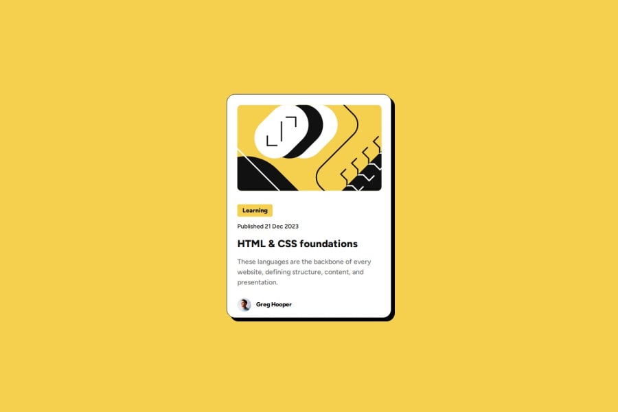
Design comparison
SolutionDesign
Community feedback
- P@giropa832Posted 5 months ago
Great work!
Here is some feedback:
- When resizing the card with developers tools, it slips out on the view. You can resolve this with max-width: min (384px, 90vw) so it ensures that it will never reach 100% of the screen.
- It must have been difficult to find the exact color in HEX. You can always use hsl(gradient, percentages) to express the colors ad described on the Figma file. You can also add them as variables in your css with :root.
- Really nice transition when hovering!
I hope the feedback helps.
Marked as helpful1
Please log in to post a comment
Log in with GitHubJoin our Discord community
Join thousands of Frontend Mentor community members taking the challenges, sharing resources, helping each other, and chatting about all things front-end!
Join our Discord
