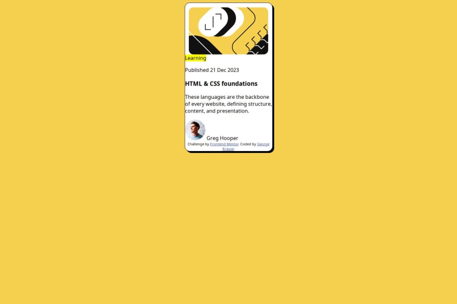
Design comparison
SolutionDesign
Solution retrospective
What are you most proud of, and what would you do differently next time?
I'm getting use to the box model, and using css flexbox.
What challenges did you encounter, and how did you overcome them?It was a challenge getting everything center on the page, then center inside different components. It was fun to learn how to do it.
What specific areas of your project would you like help with?Is there a easy color guide or vs code extension to help with choosing color combos?
Community feedback
Please log in to post a comment
Log in with GitHubJoin our Discord community
Join thousands of Frontend Mentor community members taking the challenges, sharing resources, helping each other, and chatting about all things front-end!
Join our Discord
