Design comparison
Community feedback
- @rayaattaPosted 10 months ago
Hello 👋, congratulations on completing this challenge 🎉
I have some suggestions to make your code much more responsive.
1 You used
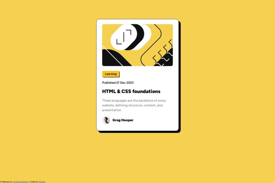
width: 380px;On the.containerThis is okay but in case a screen is less than 380px wide then the card overflows the view port. You can make it more responsive by usingmax-width:min(90%,380px)This means it is 380px but on smaller screens it only covers 90% of the width.After making this adjustment your image will overflow because you set it to a fixed width of 370px. It is a bad practice to set a fixed height or width of an image. The most recommended practice is giving it a max-width.Usually
img {
display:block;
max-width:100%;
}
This would be a more responsive approach
2 In order to center the card on any screen add this code snippet to body.
min-height:100vh;
display:flex;
align-items: center;
justify-content: center;
Then remove the margin properties from
.containerI hope this helps 🙃
Otherwise your solution is neat👍
Happy coding ✌️
Marked as helpful1
Please log in to post a comment
Log in with GitHubJoin our Discord community
Join thousands of Frontend Mentor community members taking the challenges, sharing resources, helping each other, and chatting about all things front-end!
Join our Discord
