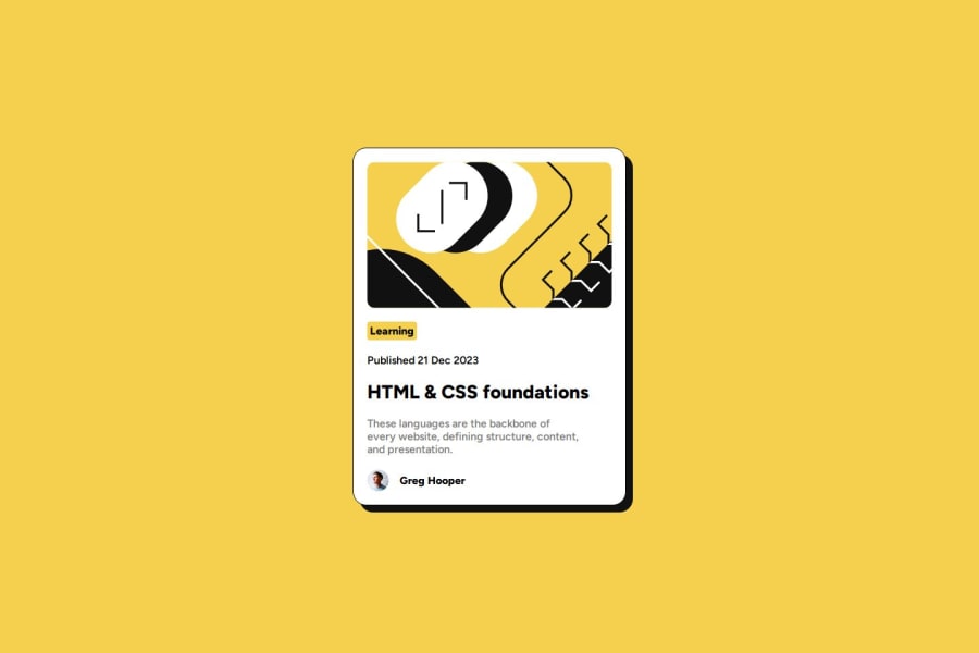
Design comparison
Solution retrospective
Hey! This is Nacho
This is my solution of this project!
Tech Stack
- HTML
- CSS
- BEM
Really simple, I had fun making this challenge!
Hope you like it! Have a good one
Community feedback
- @petritnurediniPosted 10 months ago
Congratulations on completing your Frontend Mentor project! It's great to see your hard work and dedication to learning front-end development. Here are a few suggestions to enhance your project:
-
CSS Vendor Prefixes:
- Modern browsers handle many CSS properties well without vendor prefixes. Properties like
border-radius
in your.card__image
class and others are widely supported, so the prefixed versions (-webkit-
,-moz-
, etc.) may be unnecessary. This reduces the CSS file size and maintenance complexity. You can check current browser support on Can I Use.
- Modern browsers handle many CSS properties well without vendor prefixes. Properties like
-
Responsive Design:
- For better responsive design, consider using relative units like
em
orrem
instead of fixed units likepx
for font sizes, paddings, and margins. This ensures better scalability and accessibility. - The media query syntax in your CSS seems incorrect. It should be
@media (max-width: 480px) {...}
instead of@media (width <= 480px) {...}
. Learn more about media queries here.
- For better responsive design, consider using relative units like
-
Semantic HTML:
- The use of
<article>
for the card is excellent. However, consider wrapping the card title (<h1 class="card__title">
) in an<a>
tag instead of usingcursor: pointer;
on the heading. This makes it more accessible and semantically correct as clickable elements.
- The use of
Further Learning:
- Check out MDN Web Docs for more details on CSS and HTML best practices.
- To understand more about responsive design, Responsive Web Design Basics is a great resource.
Keep up the good work, and continue to challenge yourself with new projects. Your journey in front-end development is off to a strong start! šš
1 -
- @danielmrz-devPosted 10 months ago
Hello there! šš½āāļø
Your solution looks excellent!
I have a suggestion about your code that might interest you:
š If you don't have the Figma design files, I recommend using a browser extension called Perfect Pixel.
It allows you to compare your finished project with the design images that come along when you download the project and check the (almost exact) dimensions. It's very useful!
I hope it helps you in future projects! š
Other than that, great job!
0
Please log in to post a comment
Log in with GitHubJoin our Discord community
Join thousands of Frontend Mentor community members taking the challenges, sharing resources, helping each other, and chatting about all things front-end!
Join our Discord