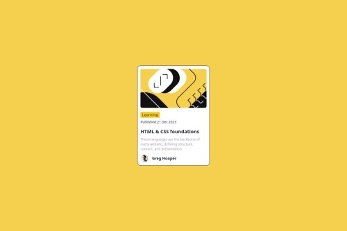
Design comparison
SolutionDesign
Solution retrospective
Worked on building this card and it's my first time, I was able to handle mobile responsiveness well.
Community feedback
- @danielmrz-devPosted 10 months ago
Hello @Masood-zone!
Your solution looks great!
I have a suggestion for improvement:
- For semantic reasons, use
<main>
to wrap the main content instead of a<div>
.
š This tag change does not impact your project visually and makes your HTML code more semantic, improving SEO optimization as well as the accessibility of your project.
I hope it helps!
Other than that, great job!
0 - For semantic reasons, use
- @BlackpachamamePosted 10 months ago
Greetings! you have done a great job š
š Some accessibility and semantics recommendations for your HTML
- To improve the semantics of your HTML, you can change your
<div class="container">
to a<main class="container">
- You don't need
margin: auto
to center the content. You can add thejustify-content: center
property to yourbody
to achieve the same result - Texts must always go in a header or paragraph tag. Think about which label makes the most sense for each thing. Greg Hooper text should be inside a
p
or a header. Thespan
tag is only used to give a different style to a part of a text
0 - To improve the semantics of your HTML, you can change your
Please log in to post a comment
Log in with GitHubJoin our Discord community
Join thousands of Frontend Mentor community members taking the challenges, sharing resources, helping each other, and chatting about all things front-end!
Join our Discord