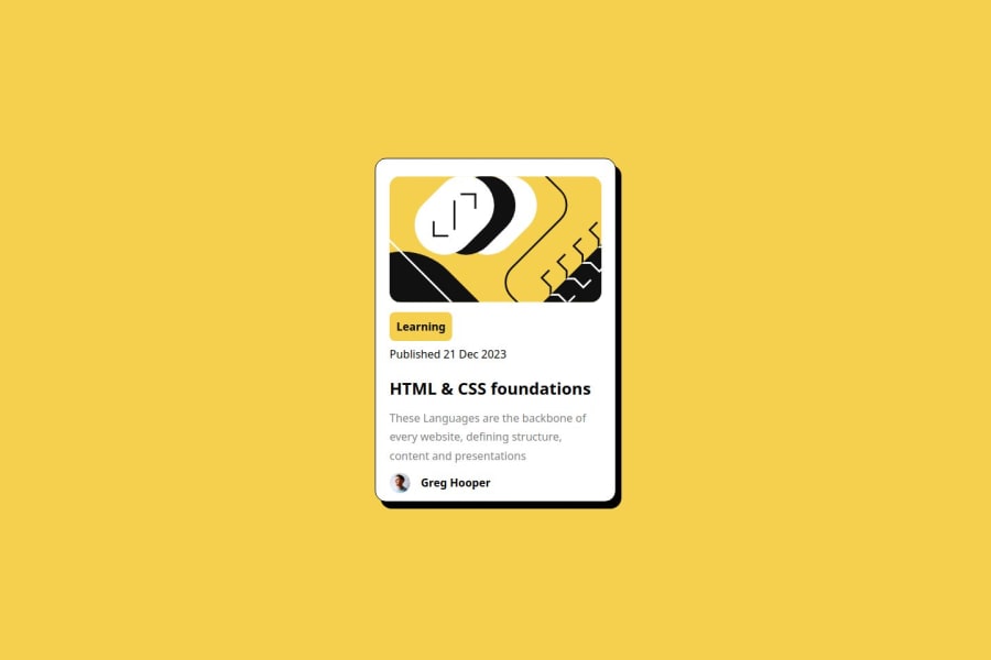
Design comparison
Solution retrospective
Learned something new about how to use box shadows to product cards UI components
What challenges did you encounter, and how did you overcome them?One challenge I have faced is coming up with the page's correct DIV's alignment, which I really need to master it. I'll be open to any kind of advices/suggestions/resources to get good hold on arrangement of divs for any basic to complex UI development
What specific areas of your project would you like help with?I'm mostly struggling in coming up with correct the alignments/structure of the page using DIV, what is the step by step I need to follow to get the correct structure? like when to use divs or where to not use divs, so on so forth. And again I'll be open to any kind of suggestions.
Community feedback
Please log in to post a comment
Log in with GitHubJoin our Discord community
Join thousands of Frontend Mentor community members taking the challenges, sharing resources, helping each other, and chatting about all things front-end!
Join our Discord
