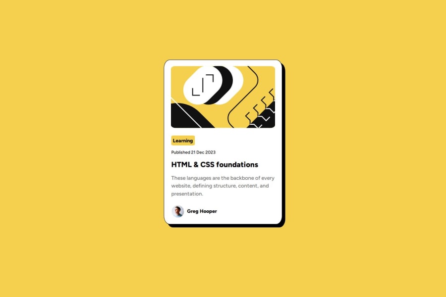


Design comparison
SolutionDesign

Solution retrospective
What specific areas of your project would you like help with?
I'm not sure whether the mobile view will be ok like this in the future, or should I do something differently?
Community feedback
- @TinymolyDDPosted 13 days ago
Nice implementation! The result is quite accurate! I have two small suggestions:
- Consider incorporating Semantic HTML to improve accessibility.
- In the CSS, using classes instead of IDs as selectors can increase reusability.
For your question: In this challenge, a fixed-width card (384px) might not display well on smaller screens (e.g., iPhone SE with a width of 375px) unless responsive design is applied. I recommend learning about
@mediaqueries for this.Great job overall! 😊
Marked as helpful1@siskadavid0309Posted 12 days ago@TinymolyDD Thank you for the helpful advices!
1

Please log in to post a comment
Log in with GitHubJoin our Discord community
Join thousands of Frontend Mentor community members taking the challenges, sharing resources, helping each other, and chatting about all things front-end!
Join our Discord